• By Walter R. Paczkowski, Ph.D.
• May 11, 2018
• 3:54 pm
Welcome to the Analytical Support Center, Data Analytics Corp.’s blog site. The purpose of this blog is to share and develop my ideas, insights, and musings about what I call Deep Data Analytics. There is a reason why I used the operative word “Deep.” I believe that the goal of data analysis is to dig deeply into our data to extract the Rich Information needed for decision making, whether the decisions are for business or public policy. The data themselves and the simple statistics that describe them, such as means and proportions, are Poor information. In fact, the data themselves are not information but a veil that hides or obscures the information buried inside the data. Simple statistics give us some insight, but not much. The treasure trove of information, the Mother Lode of Information that I call Rich Information, lies buried deep inside the data, waiting there for us to find and extract it. But not with simple statistics. More sophistication is needed to lift the veil of data.
The sophistication is most important in the modern age of Big Data. The complexity of Big Data, something I will comment on in future blog postings, will not easily yield Rich Information. Even Small Data, another concept I will discuss in the future, requires more powerful tools to extract their information content.
In future blog postings, I will cover Deep Data Analytical topics such as:
1. The distinction between Poor and Rich Information
2. The distinguishing characteristics of Big and Small Data
3. The main concepts for analyzing text, a great source of Rich Information
4. How to identify missing data patterns
5. How to handle missing data
6. How to understand the structure of a new (big or small) data set
7. Tools-of-the-trade every deep data analyst must know
8. Various ways to model data
9. How to visualize data, not for reporting but for Deep Data Analysis
10. Software applicable for different types of analysis
I look forward to writing this blog not only because it will help me to clarify my own thoughts about Deep Data Analytics, but because it will also give me an opportunity to learn from others about what works and does not work, what else can be done to extract information, and if my thoughts are even on the right track about Rich Information and Deep Data Analytics. So, I hope to learn and grow as well as help others.
By Walter R.
⦁ Paczkowski , Ph.D.
⦁ September 25, 2018
⦁ 3:22 pm
I previously wrote about a model for studying a situation where individuals are nested in a higher-level group. That higher level group could be neighborhoods, cities or towns, medical practices, shopping clubs, etc. They could even be market segments. This last one is interesting because the whole purpose of market segmentation is to classify consumers into homogeneous groups so as to develop better marketing and pricing offers for them; better target marketing, if you wish. The process of segmentation, however, by definition, creates a nested structure since the individual consumers are nested in a segment and so segment characteristics influence their buying behaviors.
Let’s consider a problem involving price setting for stores in a retail chain. Stores come in different sizes (i.e., selling surfaces). There are small storefronts (e.g., Mom & Pops) and “Big Box” stores (e.g., warehouse clubs). Even within one chain, store sizes vary, perhaps due to geography. For example, stores vary in size between Manhattan and Central Jersey. Suppose we have (fictional) data on one consumer product sold through a retail chain in New England states. The chain has six stores: 3 in urban areas (i.e., small stores) and 3 in suburban areas (i.e., large stores). We also know the store sizes in square footage. We have data on the purchase behavior of 600 consumers. Each consumer’s daily purchases and the prices they paid were averaged to one annual number each so n = 600. We also know the consumer’s household income. We need to estimate a price elasticity for this product.
A simple, naive model is a pooled regression based on a Stat 101 data structure. This means that all the data are in just one dataset with no distinction of store size or location. A demand model in log terms (log quantity, log price, and log income) could be estimated. The advantage of using logs is that the estimated price coefficient is the price elasticity. Here are the results of a pooled model.

The price elasticity is -2.4, so highly elastic.
A better model would account for the store size, proxied by location: urban and suburban. The location is a reasonable proxy since large stores are in suburban areas. A location dummy would be defined that would be 1 for suburban stores and 0 for urban stores. Here are the results when a dummy variable is added.

The price elasticities are: Urban elasticity: -1.2; Suburban: -0.6. Intuitively, this should be accepted since urban stores face more competition. Food stores in Manhattan, for example, face stiff competition since there are several food stores/restaurants on each block. Suburban stores, however, are more spread out geographically so the value of time has to be factored in when shopping. This would make the demand for a product more inelastic.
The dummy variable approach would classify store size into small/large or urban/suburban. Store size, however, as a macro or level 2 context or ecological factor, may by a proxy for hard-to-measure factors such as customer characteristics, types of shopping trips (i.e., goals), shopping time constraints and so should be used. A product is nested in a store which is characterized by size, so the size has to be considered. Here are the results of a multilevel model with varying intercepts, each intercept representing a store size. Since there are six stores, there are six intercepts.
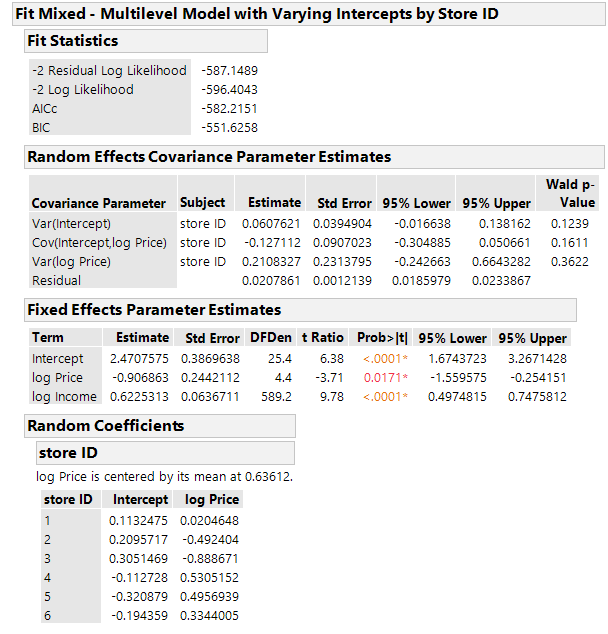
The estimated parameters for store 1 (which is small at 397 square feet) are:
Net Intercept: 2.47 + 0.11 = 2.58
Price Effect: -0.91 + 0.02 = -0.89
So, the estimated model is:
ln(Quantity) = 2.58 – 0.89 x ln(Price) + 0.62 x ln(Income)
The price elasticity is: -0.89.
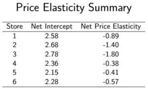
A graph of the price elasticities is:

Taking account of the store size, a level 2 macro variable, allows for a richer model and, therefore, better price elasticity estimates.
By Walter R.
⦁ Paczkowski , Ph.D.
⦁ August 27, 2018
⦁ 2:15 pm
I have been arguing that the structure of the data is an overlooked but important aspect of any empirical investigation. Knowing the structure is part of “looking” at your data, a time-honored recommendation. This recommendation, however, is usually stated in conjunction with discussions about graphing data and ways to visualize relationships, trends, patterns, and anomalies in your data. Sometimes, you are told to print your data and physically look at it as if this is should reveal something you did not know before. This type of visualization may help identify large missing value patterns or coding errors, although there are other more efficient ways to gain this insight. Packages in R and a platform in JMP, for example, identify and portray missing value patterns. If the data set is large, especially with thousands of records and hundreds of variables, physically “looking” at your data is impractical to say the least. Visualization, whether by graphs or a physical inspection, while important, will not reveal anything about the types of structure I am concerned with, structure in which cases are subsets of larger entities so that cases are nested under the larger entities; there is a hierarchy. This can only come from knowing what your data represent and how they were collected. The data collection could be by cluster sampling or it could be just an inherent part of the data.
Examples of nested structures abound. The classic example usually referred to when nested or multilevel data are discussed is students in classes which are in schools which are in school districts. The hierarchical structure is inherent to the data simply because students are in classes which are in schools which are in districts. A hierarchical structure could result, by the way, if cluster sampling is used to select schools in a large metropolitan district and then used again to select classes. Whichever method is used, the nesting is self-evident which is why it is usually used to illustrate the concept. Examples for marketing and pricing include:
⦁ Segments
⦁ Stores
⦁ Marketing regions
⦁ States
⦁ Neighborhoods
⦁ Organization membership
⦁ Brand loyalty
Consumers are nested in segments; they are nested in stores; they are nested in neighborhoods, and so forth. This nesting must be accounted for in modeling behavior. But how?
The basic OLS model, so familiar to all who have taken a Stat 101 course, is not appropriate. Sometimes analysts will add dummy variables to reflect group membership (or some other form of encoding of groups such as effects coding), but this does not adequately reflect the nesting, primarily because there may be key drivers that determine the higher-level components of the structure. For example, consider a grocery store chain with multiple locations in urban and suburban areas. Consumers are nested within the stores in their neighborhood. Those stores, and the neighborhoods they serve, have their own characteristics or attributes just as the consumers have their own. The stores in urban areas may, for instance, have smaller footprints because real estate is tighter in urban areas but have larger ones in suburban areas where real estate is more plentiful. Stores in Manhattan are smaller than comparable stores in the same chain located in Central Jersey. The store size determines the types of services that could be offered to customers, the size of stock maintained, the variety of products, and even the price points.
The basic OLS model will not handle these issues. An extension is needed. This is done by modeling the parameters of the OLS model where those models reflect the higher level in the structure and these models could be functions of the higher-level characteristics. There could be a two-stage model specified, in a simple case, as:

Notice how the parameters have a double script indicating that they vary. The Stage II model which defines the parameters could be:
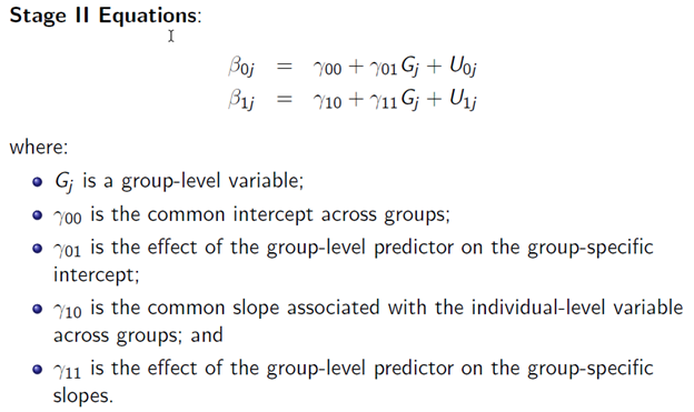
The new parameters in the Stage II equations are called hyperparmeters. The error terms in the Stage II Equations are called macro errors because they are at the macro level. They could be specified as:

Notice the double subscripts on the variance terms. A covariance between the intercept and slope errors and the may exist and represented by

The group-specific parameters have two parts:
⦁ A “fixed” part that is common across groups; and
⦁ A “random” part that varies by group.
The underlying assumption is that the group-specific intercepts and slopes are random samples from a normally distributed population of intercepts and slopes.
A reduced form of the model is:
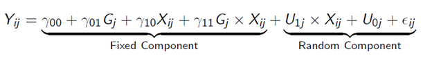
Now this is a more complicated, and richer, model. Notice that the random component for the error is a composite of terms, not just one term as in a Stat 101 OLS model. A dummy variable approach to modeling the hierarchical structure would not include this composite error term which means that the dummy variable approach is incorrect; there is a model misspecification – it is just wrong. The correct specification has to reflect random variations at the Stage I level as well as at the Stage II level and, of course, any correlations between the two. Also notice that the composite error term contains an interaction between an error and the Stage I predictor variable which violates that OLS Classical Assumptions. A dummy variable OLS specification would not do this.
Many variations of this model are possible:
⦁ Null Model: no explanatory variables;
⦁ Intercept varying, slope constant;
⦁ Intercept constant, slope varying; and
⦁ Intercept varying, slope varying.
The Null Model is particularly important because it acts as a baseline model — no individual effects.
I will have more to say about this model and gives examples in future posts, so be sure to come back for more.
By Walter R.
⦁ Paczkowski, Ph.D.
⦁ July 23, 2018
⦁ 3:33 pm
There is more to data structure than the almost obvious aspects I’ve been discussing. Take, as an example, my comments about clustering demographic variables to develop segments of consumers. The segments were implicit (i.e., hidden or latent) in the demographics. Using some clustering procedure such as hierarchical, KMeans, or latent variable clustering reveals what is there all the time. By collapsing the demographics to a new single variable that is the segments, more structure is added to the data table. Different graphs can now be created for an added visual analysis of the data. And, in fact, this is what is done so frequently – a few simple graphs (the ubiquitous pie and bar charts) are created to summarize the segments and a few key variables such as purchase intent by segments or satisfaction by segments.
In addition to the visuals, sometimes a simple OLS regression model is estimated with the newly created segments as an independent variable. Actually, the segment variable is dummified and the dummies are used since the segment variable per se is not quantitative but categorical and so it cannot be used in a regression model. Unfortunately, an OLS model is not appropriate because of a violation of a key independence assumption required for OLS to be effectively used. This assumption is independence of the observations. In the case of the segments, almost by definition the observations are not independent because the very nature of segments says that all the consumers in a single segment are homogeneous. So, they should all behave “the same” and are therefore not independent.
The problem is that there is a hierarchical or multilevel structure to the data that must be accounted for when estimating a model with data such as this. There are micro or first level units nested inside macro or second level units. The consumers are the micro units embedded inside the segments that are the macro units. The observations used in estimation are on the micro units. The macro units give a context to these micro units and it is that context that must be accounted for. There could be several layers of macro units so my example is somewhat simplistic. This diagram illustrates a possible hierarchy consisting of three macro levels for consumers:
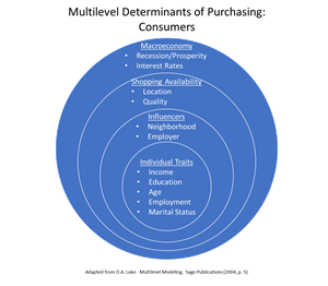
Consumer traits such as their income and age would be used in modeling but so would higher level context variables. In the case of segments there is just a single macro level.
Business units also could have a hierarchical structure. A possibility is illustrated here:
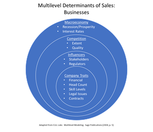
The macro levels usually have key driver variables that are the influencers for the lower level. For consumers, macroeconomic factors such as interest rates, the national unemployment rate, and real GDP in one time period would influence or drive how consumers behave. Interest rates in that time period would be the same for all consumers. Over several periods, the rates would change but they would change the same way for all consumers. Somehow, this factor, and others like it, have to be incorporated in a model. Traditionally, this has been done either by aggregating data at the micro level to a higher level or by disaggregating the macro level data to a lower level.
Both data handling methods have issues:
Aggregation problems:
⦁ Information is more hidden/obscure. Recall that information is buried inside the data and must be extracted.
⦁ Statistically, there is a loss of power for statistical tests and procedures.
Disaggregation problems:
⦁ Data are “blown-up” and artificially evenly spread.
⦁ Statistical tests assume there are independent draws from a distribution, but they are not since they have a common base thus violating the key assumption.
⦁ The sample size is affected since measures are at a higher level than what the sampling was designed for.
This last point on sample size has a subtle problem. The sample size is too large because the measurement units (e.g., consumers) are measured at the wrong level SO the standard errors are too small SO test statistics are too large SO you would reject the Null Hypothesis of no effect too often.
My Next Post
In my next post, I’ll explore other issues associated with a multilevel data structure and how to handle such data.
AGGREGATING DATA, DATA STRUCTURES, DISAGGREGATING DATA, HIERARCHICAL DATA, MULTILEVEL DATA, OLS
By Walter R.
⦁ Paczkowski , Ph.D.
⦁ July 13, 2018
⦁ 2:59 pm
I already discussed explicit and implicit data structures based on a variable in a single data table. It’s important that you recognize both of these because these structures enhance your analysis and allow you to extract more information and insight from your data.
Just to review and summarize, explicit structure is based on variables that are already part of your data table. Gender, political party, education level, store last purchased at, and so forth are examples of variables that are most likely already present in a data table. Implicit structure is based on variables that buried or are latent inside a single variable or are combinations of explicit structural variables. They can be defined or derived from existing variables. Examples are regions based on states, age groups based on age in years, and clusters based on demographic variables.
A feature of these explicit and implicit structural variables is that they define structure across the records within a single data table. So, the explicit structural variable “gender” tells you how the rows of the data table – the cases or subjects or respondents – are divided. This division could be incorporated in a regression model by including a gender dummy variable to capture a gender effect.
There could be structure, however, across columns, again within a single data table. On the simplest level, some groupings of columns are natural or explicit (to reuse that word). For example, a survey data table could have a group of columns for demographics and another for product performance for a series of attributes. A Check-all-that-apply (CATA) question is another example since the responses to this type of question are usually recorded in separate columns with nominal values (usually 0/1). But like the implicit variables for the rows of the data table, new variables can be derived from existing ones.
Consider, for example, a 2010 survey of US military veterans conducted by the Department of Veterans Affairs. They surveyed veterans, active duty service members, activated national guard and reserve members, family members and survivors to help the VA plan future programs and services for veterans. The sample size was 8,710 veterans representing the Army, Navy, Air Force, Marine Corps, Coast Guard, and Other (e.g. Public Health Services, Environmental Services Administration, NOAA, U.S. Merchant Marine). One question asked the vets to indicate their service branch. This is a CATA question with a separate variable for each branch and each variable is nominally coded as 0/1. There were 221 respondents who were in more than one branch. A new variable could be created that combines the components through simple addition into one new variable to indicate the branch of service plus Multiple Branches for those in more than one branch. This one structural variable would replace all the CATA variables plus it would include some new insight for the multiple branches. Incidentally, this new variable would also add structure to the rows of the data table since its components are themselves classifiers.
Combining variables is especially prevalent in large data tables with hundreds if not thousands of variables which makes the data table “high dimensional.” A high-dimensional data table is one that not only has a large number of variables, but this number outstrips the number of cases or observations. If N is the number of cases and Q is the number of variables, then the data table is high dimensional if Q >> N. You can see a discussion of this in my latest book on Pricing Analytics which is listed elsewhere on my website. Because of this situation, standard statistical methods (e.g., regression analysis) become jeopardized. Regression models, for example, cannot be estimated if Q >> N. So, some means must be employed to reduce the dimensionality.
Just as there is cluster analysis for the rows of a data table, an approach most analysts are readily familiar with, so there is cluster analysis for the variables. Another technique is Principal Components Analysis (PCA). Both have the same goal: dimension reduction. PCA is probably better known, but variable clustering is becoming more popular because the developing algorithms are handling different types of data plus it avoids a problem with PCA. The data types typically found in a data table are quantitative and qualitative (also known as categorical). The former is just standard numbers, interval and ratio, that most people would immediately think about. The latter consists of classifiers such as gender, political party, and region. These may be represented by numbers in the data table or words such as “Male” and “Female.” If words are used, they are usually encoded with numerics but the codes are meaningless and arbitrary. In these three examples, the numbers would be nominal values. Ordinal values are also possible if there is an intuitive ordering to the data such as “Low-Level Manager”, “Mid-level Manager”, and “Executive.” Technically, PCA is designed for quantitative data because it tries to find components based on variances which are quantitative concepts. There are R packages that try to circumvent this issue, but, nonetheless, PCA in general has this problem. Variable clustering algorithms avoid this issue.
The following table summarizes the discussion so far:

By Walter R.
⦁ Paczkowski , Ph.D.
⦁ July 2, 2018
⦁ 3:27 am
Since my blog posts started a few weeks ago, I have been musing about data structures and their importance for Deep Data Analysis. In my previous post, I noted that some structures across the rows of a data table are explicit while others are implicit. The explicit structures are obvious based on the variables in the data table. Political party affiliation is the example I have been using. A variable on party affiliation is in the data table so a division of the data by party is obvious. How this variable is actually used is a separate matter, but it can and should be used to extract more information from the whole data table. The regions of the country, the variable I discussed last time, is implicit in the data table. There was no variable named “Region” present in the table, yet it was there in the sense that the states comprising the regions were there, so states are nested under regions. As I noted in the last post, the states are mapped to regions by the Census Department, and this mapping is easy to obtain. Using this Census Department mapping, a Region variable could be added that was not previously present, at least explicitly. With this added variable, further cuts of the data are possible leading to more detailed and refined analysis.
The explicit structural variables are clear-cut – they are whatever is in the data table. The implicit structural variables also depend on what is already in the data table, but their underlying components have to be found and manipulated (i.e., wrangled) into the new variables. This is what I did with mapping States to Regions. Variables that are candidates for the mapping include, but are certainly not limited to, any of the following:
⦁ Telephone numbers:
⦁ Extract international codes and domestic US area codes.
⦁ ZIP codes and other postal codes.
⦁ Time/Date stamps for extracting:
⦁ Day-of week
⦁ Work day vs weekend
⦁ Day-of-month
⦁ Month
⦁ Quarter
⦁ Year
⦁ Time-of-day (e.g., Morning/afternoon/evening/night)
⦁ Holidays (and holiday weekends)
⦁ Season of the year
⦁ Web addresses
⦁ Date-of-Birth (DOB)
⦁ Age
⦁ Year of birth
⦁ Decade of birth
⦁ SKUs which are often combinations of codes
⦁ Product category
⦁ Product line within a category
⦁ Specific product
You could also bin or categorize continuous variables to create new discrete variables to add structure. For example, age may be calculated from the date-of-birth (DOB) and then the people may be binned into pre-teen, teen, adults, and seniors.
In each of these cases, a single explicit variable can be used to identify an implicit variable. The problem is compounded when several explicit variables can be used. But which ones and how? This is where several multivariate statistical methods come in. To mention two: cluster analysis and principal components analysis (PCA). The former can be used to group or cluster rows of the data table based on a number of explicit variables. The result is a new implicit variable that can be added to the data table as a discrete variable with levels or values identifying the clusters. This new discrete variable is much like the Region and Party Affiliation variables I previously discussed. For instance, consider an enhanced version of the data table from the prior posts. The enhancement is the addition of variables, at the state level, for education attainment (percent with a high school education, percent with a bachelor’s degree, and percent with an advanced degree), the state Human Development Index (HDI), and the state Gini coefficient as a measure of income inequality. A hierarchical cluster analysis (using Ward’s method) was done. The dendrogram is shown here:
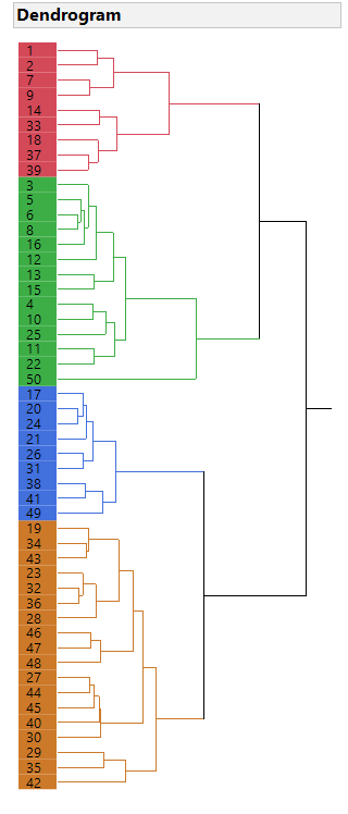
Four clusters were identified and added to the main data table. The distribution is shown here:
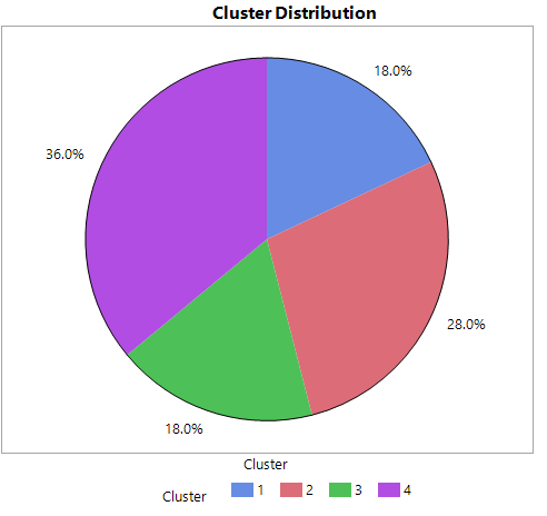
This new variable is discrete with four levels so it can be used to dig deeper into the original data. More structure has been imposed.
In future blog postings, I will explore even more structure across variables.
By Walter R.
⦁ Paczkowski , Ph.D.
⦁ June 20, 2018
⦁ 2:59 pm
Understanding the structure of your data is very important for data analysis because the structure almost dictates the type of analysis you can and should do to reach your objective. In my previous post, I talked about a simple structure of a rectangular array with numeric/continuous variables and then extended that structure slightly by including a nominal/discrete variable. I referred to the first case as the Stat 101 case because the analysis was straightforward using the concepts and tools developed n that course. These include a histogram and summary statistics. These do, of course, provide insight, but not terribly much insight. Certainly not enough to be the basis for a multi-billion-dollar business merger or the enactment of a major tax bill or the decision about which presidential candidate you should vote for in the next election. The slight extension adds more insight, but again not much.
In the last post, the structure was explicit in the data set: the Major Political Party Affiliation was a variable that was part of the data set. This divided the states into “red” and “blue” states based on the majority party affiliation. Some analysis was done using this variable. But the analysis was evident because the variable was right there in the data set; the structure was explicit. There are times when a structure is present in the data but only implicitly. A variable may have to be added to the data set to reveal that implicit structure which could then be used for further analysis, analysis that otherwise would have gone undone simply because that structure was not evident.
Let’s consider the data set from the last post. This had state data on unemployment and household income plus political part affiliation. An implicit variable that could be added is the regional assignment of each state. I expended the data set for this post to include the US Census Region classification of each state. The Census Bureau assigns each state to one of four regions: Northeast, South, Midwest, and West. The distribution of the states across the regions is shown here:

The inclusion of regions complicates the structure slightly because there are now four divisions of the data that was not evident before: the states are embedded or clustered within the regions. This division is important because any regional issues and tendencies would affect the states that are members of those regions. And the regions do differ in many ways. For example, consider that “a broad analysis of … general trends suggests regions do vary in their mean levels of personality traits. For example, Neuroticism appears to be highest in the Northeast and Southeast and lowest in the Midwest and West; Openness appears to be highest in the New England, Middle Atlantic, and Pacific regions and lower in the Great Plain, Midwest, and southeastern states; and Agreeableness is generally high in the Southern regions and low in the Northeast. The spatial patterns for Extraversion and Conscientiousness do not appear consistent across studies.” (P. J. Rentfrow, et al. “Divided We Stand: Three Psychological Regions of the United States and Their Political, Economic, Social, and Health Correlates.” Journal of Personality and Social Psychology, 2013, Vol. 105, No. 6, 996–1012)
This simple extension of the structure of the data, like the one discussed in my last post, involves a grouping of data. In the last case, the grouping was simple and we were able to do some simple analyzes, primarily a t-test for differences in means. We cannot do a t-test of regional differences, where the t-tests are based on pairs of regions, to determine if there are differences among the regions because of the multiple comparisons problem. With four regions, there are 6 possible pair-wise comparisons. The problem is that the error rate for these comparisons is inflated. If the traditional error rate (an experiment-wise error rate) is set at 0.05, meaning that there is a 5% chance of making an incorrect decision, then the inflated rate (a family-wise error rate) that accounts for the multiplicity of tests is now 0.265, more than a five-fold increase in the error rate. This means that the probability of incorrectly making an incorrect decision among all six possible tests is more than 25%. The Tukey multiple comparisons procedure is usually used to adjust or correct for this inflated error rate.
Consider the median annual household income for the 50 US states but aggregated by the four Census Regions. A diamond plot shown here

indicates that there is a difference in income level between the Northeast and the South regions. The indication is based on the diamonds that do not overlap. On the other hand, there does not appear to be any difference between the West and Midwest regions.
The Tukey mean comparison test for all combinations, shown here supports the suggestion from the diamond plot:

The Connecting Letter Report and the Ordered Differences Report support the suggestion that the Northeast and the South differ for household income. The implication is that any modeling that involves household income should account for a regional effect.
The goal of any data analysis is to extract information. In this example, some valuable information would have been overlooked if the implicit structure was itself ignored. I’ll explore implicit structures in my next post.
By Walter R.
⦁ Paczkowski , Ph.D.
⦁ June 1, 2018
⦁ 4:55 pm
In my last blog, I discussed the importance of understanding the structure of your data before you do any empirical work such as calculating statistics, doing data visualization, or estimating advanced models. The structure will determine the type of analysis you can do and aid in the interpretation of results. More importantly, the structure determines how much information can be extracted.
Telling you to know the structure begs two questions:
⦁ What is structure?
⦁ How does structure impact analysis?
I noted before that there is a simple and a complex data structure. The simple one is what you’re shown and taught in Stat 101. The data typically are in a rectangular array or data table which is just a matrix of rows and columns. The rows are objects and the columns are variables. An object can be a person or an event. The words object, case, individual, event, observation, and instance are often used interchangeably. Each row is an individual case and each case is in its own row. There are never any blank rows. The columns are the variables, features, or attributes, all three terms are used interchangeably. Each variable is in one column with one variable per column. This is the structure of a Stat 101 data table.
The Stat 101 data table also typically has just numeric data, usually continuous variables measured on a ratio scale. For a ratio scaled variable, the distance between values is meaningful (to say one object to twice another has meaning) and there is a fixed, nonarbitrary origin or zero point so a value of zero means something. For example, real GDP is a ratio value since zero real GDP means that a country produced nothing. Sometimes, a discrete nominal variable would be included but the focus is on the continuous ratio variable. A nominal variable is categorical with a finite number of values or levels, the minimum is, of course, two; with one level it’s then just a constant. With this simple structure, there is a limited number of operations and analyses you can do and, therefore, a limited amount of information can be extracted.
A simple example that might be used in an elementary statistics course is the following based on state data*:
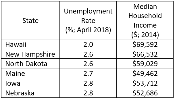
* Only 6 out of 50 states shown. Sources:
Unemployment rate: https://www.bls.gov/web/laus/laumstrk.htm
Income: https://www.cleveland.com/datacentral/index.ssf/2015/09/blue_states_red_states_rich_st.html
This is a simple data structure: a 50 x 3 rectangular array with each state in one row and only one state per row. There is one character variable and two numeric/continuous variables. The typical analysis would be very simple. Means for the unemployment rate and household income would be calculated, although the median income might be used. Histograms and boxplots could be developed to show the distributions. These might be combined into one display such as the following:


You could also display the pattern between the two series using a scatter plot as shown here:

There is one large outlier in the upper right corner (which happens to be Alaska) and what appears to be a negative relationship between income and unemployment if the outlier is ignored. This relationship might be expected intuitively. Otherwise, not much else is evident. However, a slightly more advanced analysis might include a contour or density plot relating the two series. Such a plot is shown here:
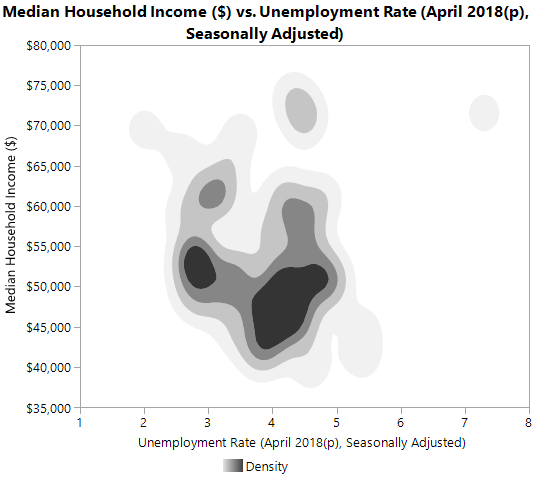
The two dark patches indicate a concentration or clustering of states: a large black patch with high unemployment and low income and a second smaller black patch for low unemployment and not much better income. This is slightly more informative.
These are standard for a simple structure such as this, although the contour plot might be a little more advanced. The information content extracted is minimal at best.
Now reconsider the above but with one new variable: the dominant political party.
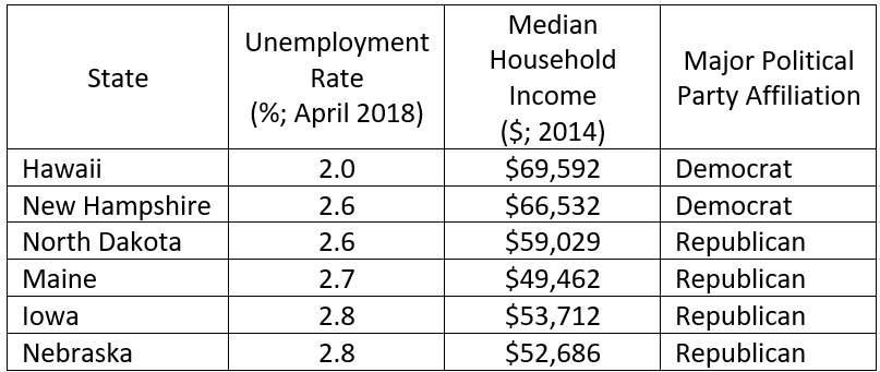
Source for party affiliation: https://www.cleveland.com/datacentral/index.ssf/2015/09/blue_states_red_states_rich_st.html
This is now a 50 x 4 data table with one new character variable. The political party affiliation is based on 2 out of 3 party affiliation for governor and the two US Senators. If all three are Democrats, then the state party affiliation is Democrat; if two are Democrats, then the affiliation is Democrat; the same holds for the Republicans. Party affiliation is a nominal variable with two levels.
A proportion for the party affiliation could now be calculated and displayed in a pie or bar chart such as this:

There is actually slightly more to this data structure because of the political party affiliation. This makes it a little more complex, although not by much, because the states can be divided into two groups or clusters: red (Republican) and blue (Democrat) states. The unemployment and income data can then be compared by affiliation. This invites more possible analyses and potentially useful information so the information content extracted is larger.
One possibility is a comparison of the unemployment rate by party affiliation using a two-sample t-test on the means. This would result in the following:
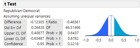
The p-values show there is no difference between the unemployment rates for red and blue states for any alternative hypothesis. But this isn’t the case for household income. A similar test shows that the blue states have a significantly higher household income:

Now this is more interesting information. A scatter plot could again be created but with a party affiliation overlay to color the markers and two regression lines superimposed, one for each party:
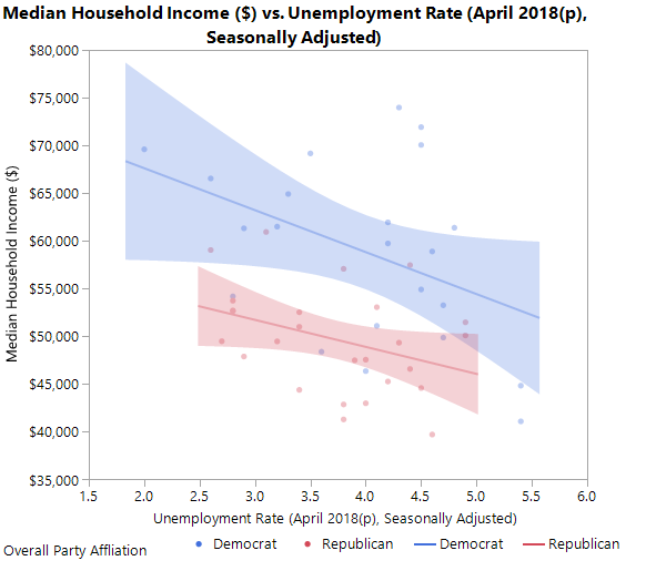
Now we see that a negative relationship but with the red states being below the blue states. A contour plot could also be created similar to the one above but with an overlay for party affiliation. This is shown here:

Now you can see that the two clusters observed before are red states. This is even more interesting information.
Adding the one extra variable increased the data table’s dimensionality by one so the structure is now slightly more complex. But there is now more opportunity to extract information. The structure is important since it determines what you can do. The more complex the structure, the more the analytical possibilities and the more information that can be extracted. Andrew Gelman referred to this as the blessing of dimensionality (http://andrewgelman.com/2004/10/27/the_blessing_of/) as opposed to the curse of dimensionality. In my next post, I will discuss even more complex structures.
By Walter R.
I remember when I started analyzing data many years ago that I would panic each time I was given a new dataset. All the rows and columns of numbers, and sometimes words, just stared at me, challenging me to uncover the information inside. Eventually I would, but it was painful. Not because I didn’t know the analysis objective or the statistical and econometric methods needed for the analysis, but because I didn’t know the structure of the data.
By poking around and “looking” at the dataset, I would, sooner or later, come to understand the structure, the panic would disappear, and I would complete the analysis.
The structure is not the number of rows and columns in the data table or which columns come first and which come last. This is a physical structure that is relatively unimportant. The real structure is the organization of columns relative to each other so that they tell a story. Take a survey dataset, for example. Typically, case ID variables are at the beginning and demographic variables are at the end; this is the physical structure. The real structure consists of columns (i.e., variables) that are conditions for other columns. So, if a survey respondent’s answer is “No” in one column, then other columns might be dependent on that “No” answer and contain a certain set of responses but contain a different set if the answer is “Yes.” The responses could, of course, be simply missing values. For a soup preference study, if the first question is “Are you a vegetarian?” and the respondent said “Yes”, then later columns for types of meats preferred in the soups would have missing values. This is a structural dependency.
The soup example is obviously a simple structure. An even simpler structure is the one that appears in Stat 101 textbooks. It has just a few rows and columns, no missing values, and no structural dependencies. Very neat and clean – and always very small. All the data needed for a problem are also in that one dataset. Real world datasets are not neat, clean, small, and self-contained. Aside from describing them as “messy” (i.e., having missing values, structural and otherwise), they also have complex structures. Consider a dataset of purchase transactions that has purchase locations, date and time of purchase (these last two making it a panel or longitudinal dataset), product type, product class or category, customer information (e.g., gender, tenure as a customer, last purchase), prices, discounts, sales incentives, sales rep identification, multilevels of relationships (e.g., stores within cities and cities within sales regions), and so forth. And this data may be spread across several data bases so they have to be joined together in a logical and consistent fashion. And don’t forget that this is Big Data with gigabytes! This is a complex structure different from the Stat 101 structure as well as the survey structure.
Knowing the structure of a dataset is critical for being able to apply the right toolset to extract information hidden or latent inside the data. The data per se are not the information – they’re just “stuff.” It’s what is inside that matters. That’s the information. The more complex the structure, the more information is inside, the more difficult it is to extract that information from the “stuff”, and the more sophisticated the tools that are needed for that extraction.
For an analogy, consider two books: Dick & Jane and War & Peace. Each book is a collection of words that are data points no different than what is in a dataset. The words per se have no meaning, just as data points (i.e., numbers) have no meaning. But both books have a message (i.e., information) that is distilled from the words; the same for a dataset.
Obviously, Dick & Jane has a simple structure: just a few words on a page, a few pages, and one or two simple messages (the information). War & Peace, on the other hand, has a complex structure: hundreds of words on a page, hundreds of pages, and deep thought provoking messages throughout. You would never read War & Peace the way you would read Dick & Jane: the required toolsets are different. And someone who could only read Dick & Jane would never survive War & Peace. You would never even approach War & Peace the way you would approach Dick & Jane. Yet this is what many of us do: we approach a complex dataset the way we approach a Stat 101 dataset.
When you read War & Peace, or a math book, or a physics book, or a history book, or an economics book, anything that is complex, the first thing you (should) do is look at the structure. This is given by the Table of Contents with chapter headings, section headings, and subsection headings all in a logical sequence. The Index at the back of the book gives hints about what is important. The book’s cover jacket has ample insight into the structure and complexity of the book and even about the author’s motive for writing the book. Also, the Preface has clues about the book’s content, theme, and major conclusions. You would not do this for Dick & Jane.
Just as you would (should) look at these for a complex book, so should you follow these steps for understanding a dataset’s structure. A data dictionary would be one place to start; a questionnaire would be obvious; missing value patterns a must; groupings, as in a multilevel or hierarchical dataset, are more challenging. Once the structure is known, then the analysis is made easier. This is not to say that the analysis will become trivial if you do this, but you will be better off than if you did not.